Accessibility Considerations
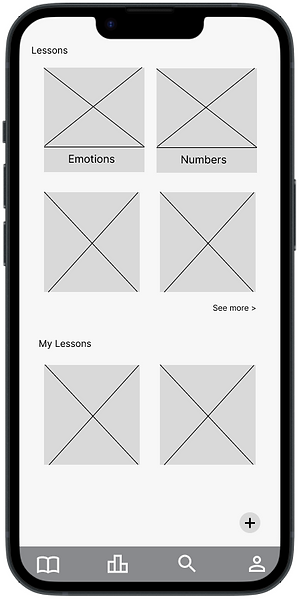
Representative icons help users easily access what they are looking for.
I chose a Sans Serif font for this project because it promotes readability. But at the same time, I made sure to use a font that would be more visually appealing to children.
Impact
Learning for Kids is an educational mobile app and a website. It offers a user-friendly interface for children to effortlessly explore various topics while providing caregivers with valuable tools to track progress and tailor the learning experience to each child's needs.
“Having a tracking progress capability is great and being able to build my lessons saves me time” - Customer C - Elementary school teacher
-Participant 2
What I've Learned
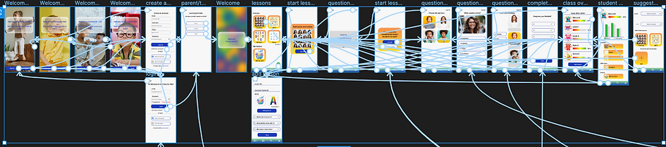
This project proved to be a challenging yet rewarding endeavor. I was taken aback by the intricate web of connections throughout the matching portion. I wonder if there is an easier way to prototype this in figma, maybe using different properties and variants could have made this process simpler. However, upon completion, the sense of accomplishment was truly gratifying.
I found great satisfaction in creating visuals tailored specifically for children. Leveraging my background in psychology, I was able to skillfully adapt colors, fonts, and other elements to cater to their unique needs and preferences.
Conduct another usability study on the responsive website to identify any missed pain-points or problems.
Improve the matching interactions, currently it works, but not very well. Maybe another software would be more capable.
I would also like to create the remainder of the lessons to ensure more of a wholistic feeling to the program.
Let's Connect!
Thank you so much for taking the time to view this case study! This was an incredibly rewarding experience. I am so excited to continue my UX/UI journey and come up with great ideas and designs to create for users.
If you are interested in connecting, get in touch with me via the contact form below, by email, or on LinkedIn.